7.14 Radiobutton widget
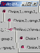
local
   C1 C2 C3 C4 C5
   Desc=td(radiobutton(text:"Choice 1 - group 1"
                       init:true
                       return:C1
                       group:radio1)
           radiobutton(text:"Choice 2 - group 1"
                       return:C2
                       group:radio1)
           radiobutton(text:"Choice 3 - group 1"
                       return:C3
                       group:radio1)
           radiobutton(text:"Choice 1 - group 2"
                       return:C4
                       init:true
                       group:radio2)
           radiobutton(text:"Choice 2 - group 2"
                       return:C5
                       group:radio2))
in
   {{QTk.build Desc} show}
   {Wait C5}
   {Show [C1 C2 C3 C4 C5]}
end
7.14.1 Description
A radiobutton is a widget that displays a textual string, bitmap or image and a diamond or circle called an indicator. If text is displayed, it must all be in a single font, but it can occupy multiple lines on the screen (if it contains newlines or if wrapping occurs because of the wrapLength option) and one of the characters may optionally be underlined using the underline option. A radiobutton has all of the behavior of a simple button: it can display itself in either of three different ways, according to the state option; it can be made to appear raised, sunken, or flat; it can be made to flash; and it invokes an Oz command whenever mouse button 1 is clicked over the check button.
Radiobuttons are grouped together with other radiobuttons, radiobuttons of menus and tbradiobuttons by specifying the same atom to the group parameter. Only one button of a same group can be on at a time. If a radiobutton is selected, the indicator is normally drawn with a selected appearance. Under Unix, the indicator is drawn with a sunken relief and a special color. Under Windows, the indicator is drawn with a round mark inside. If the radiobutton is not selected, then the indicator is drawn with a deselected appearance, and the associated variable is set to a different value (typically 0). Under Unix, the indicator is drawn with a raised relief and no special color. Under Windows, the indicator is drawn without a round mark inside.
7.14.2 Parameter List
Specific Parameters
1 action actionh group height indicatoron init return selectcolor selectimage state width
Non Specific Parameters
activebackground activeforeground anchor background bitmap borderwidth cursor disabledforeground feature font foreground glue handle highlightbackground highlightcolor highlightthickness image ipadx ipady justify look onCreation padx pady relief takefocus text tooltips underline wraplength
7.14.3 Method List
'raise'
'raise'(1:W): If the W argument is omitted then the command raises the widget so that it is above all of its siblings in the stacking order (it will not be obscured by any siblings and will obscure any siblings that overlap it). If W is specified then it must be a handle to another widget that is either a sibling of this widget or the descendant of a sibling of this widget. In this case the 'raise' command will insert this widget into the stacking order just above W; this could end up either raising or lowering the widget.
bind
bind(event:E action:A args:LA append:AP): Specifies an action LA to execute when the event E is triggered.
Actions can be specified either as a procedure, a pair
Port#Messageor a pairObject#Method(see Section 4.3.3).Events are strings (see Section 8.11.1).
The list of arguments
LAspecifies supplementary information to pass to the action, like the key code of a keypress, or the mouse coordinates of a mouse button click (see Section 8.11.2). IfLAif not specified,nilis assumed.The boolean
appendparameter specifies if the binding overrides the previous binding for this event, or adds a supplementary action. If not specified,falseis assumed.
flash
flash: Flashes the checkbutton. This is accomplished by redisplaying the checkbutton several times, alternating between active and normal colors. At the end of the flash the checkbutton is left in the same normal/active state as when the command was invoked. This command is ignored if the checkbutton's state is disabled.
get
get(parameter1:Variable1 ... parameterX:VariableX): Obtains the value of one or more parameters. parameterX must be a valid parameter for the widget. VariableX must be free variables that will receive the current value of the parameters.
getFocus
getFocus(force:B): if B is false (or by default): if the application currently has the input focus on the widget's display, this command resets the input focus for the widget's display to the widget. If the application doesn't currently have the input focus on the widget's display, the widget will be remembered as the focus for its top-level; the next time the focus arrives at the top-level, it will be redirected it to the widget. If B is true: sets the focus of the widget's display to the widget, even if the application doesn't currently have the input focus for the display. This command should be used sparingly, if at all. In normal usage, an application should not claim the focus for itself; instead, it should wait for the window manager to give it the focus. B must be a boolean.
getGrabStatus
getGrabStatus(1:V): Binds V to the atom none if there is no grab on the widget, to the atom local if there is a local grab and to global if there is a global grab. V must be a free variable.
lower
lower(1:W): If the W argument is omitted then the command lowers the widget so that it is below all of its siblings in the stacking order (it will be obscured by any siblings and will not obscure any siblings that overlap it). If W is specified then it must be a handle to another widget that is either a sibling of this widget or the descendant of a sibling of this widget. In this case the lower command will insert this widget into the stacking order just below W; this could end up either raising or lowering the widget.
releaseGrab
releaseGrab: Releases the grab on the widget if there is one, otherwise does nothing.
set
set(parameter1:value1 ... parameterX:valueX): Changes the value of one or more parameters. parameterX must be a valid parameter for the widget. valueX must be a valid value for the parameter.
setGrab
setGrab(global:B): Sets a grab on the widget. If B is true then the grab is global, otherwise it is local (B false by default). If a grab was already in effect for this application then it is automatically released. If there is already a grab on the widget and it has the same global/local form as the requested grab, then the command does nothing. Local grab affects only the grabbing application: events will be reported to other applications as if the grab had never occurred. A global grab locks out all applications on the screen, so that only the given subtree of the grabbing application will be sensitive to pointer events (mouse button presses, mouse button releases, pointer motions, window entries, and window exits). During global grabs the window manager will not receive pointer events either. Warning: whe a grab is set, it is define for the whole Oz process so that it will prevent the user to do input to other windows as well. Moreover a grab is still effective even if the window that contains the grabbed widgets is hidden. B must be a boolean.
winfo
winfo(parameter1:value1 ... parameterX:valueX): This commands works like the get method, but for window-related information. For more details, see Section 8.9.
7.14.4 Detailed Parameters List
1:B: Specifies if the button is on or off. If B is true then the button is selelected. All other radiobuttons in the same group are deselected. If B is false then the button is deselected. This can end in no radiobutton in the same group selected at all. This parameter can be used with the set() and get() methods only. B must be a boolean.
action:C: Specifies an action to execute right after the user clicked the button. C can take several different forms (see Section 4.3.1).
actionh:C: Similar to the action parameter where then handle of the widget is given as a parameter to the action to be executed. This parameter overrides the action parameter when present.
group:A: Specifies what group the radiobutton belongs to. All radiobuttons that use the same A belong to the same group (only one can be selected at a time in a group). Valid at necessary at creation time only. A must be an atom.
height:P: Specifies a desired height for the button. If an image or bitmap is being displayed in the button then the value is in screen units; for text it is in lines of text. If this option isn't specified, the button's desired height is computed from the size of the image or bitmap or text being displayed in it. P must be a valid screen distance (see Section 8.6).
indicatoron:B: Specifies whether or not the indicator should be drawn. If false, the relief option is ignored and the widget's relief is always sunken if the widget is selected and raised otherwise. B must be a boolean.
init:B: Specifies if the button is on or off. If B is true then the button is selelected. All other radiobuttons in the same group are deselected. If B is false then the button is deselected. This can end in no radiobutton in the same group selected at all. This parameter is valid at creation time only. B must be a boolean.
activebackground:C: Specifies the background color to use when drawing active elements. An element (a widget or portion of a widget) is active if the mouse cursor is positioned over the element and pressing a mouse button will cause some action to occur. For some elements on Windows and Macintosh systems, the active color will only be used while mouse button 1 is pressed over the element. C must be a valid color (see Section 8.2)
activeforeground:C: Specifies the foreground color to use when drawing active elements. An element (a widget or portion of a widget) is active if the mouse cursor is positioned over the element and pressing a mouse button will cause some action to occur. For some elements on Windows and Macintosh systems, the active color will only be used while mouse button 1 is pressed over the element. C must be a valid color (see Section 8.2)
anchor:A: Specifies how the information in a widget (e.g. text or a bitmap) is to be displayed in the widget. A must be one of these atoms: n, ne, e, se, s, sw, w, nw, or center. For example, nw means display the information such that its top-left corner is at the top-left corner of the widget.
background:C: or bg:C: Specifies the normal background color to use when displaying the widget. C must be a valid color (see Section 8.2).
bitmap:B: Specifies a Tk pre-defined bitmap to display in the widget, or a file containing a bitmap description in the standard X11 or X10 format. The exact way in which the bitmap is displayed may be affected by other options such as anchor or justify. Typically, if this option is specified then it overrides other options that specify a textual value to display in the widget; the bitmap option may be reset to an empty string to re-enable a text display. In widgets that support both bitmap and image options, image will usually override bitmap. This parameter can't be get at runtime, however it can be set. B can be one of these atoms: error, gray75, gray50, gray25, gray12, hourglass, info, questhead, question, warning, or B can be a virtual string beginning by @ and then containing the name of a bitmap description in the standard X11 or X10 format like "@x11.xbm" for example.
borderwidth:P: Specifies a non-negative value indicating the width of the 3-D border to draw around the outside of the widget (if such a border is being drawn; the relief option typically determines this). The value may also be used when drawing 3-D effects in the interior of the widget. P must be a valid screen distance (see Section 8.6).
cursor:A: Specifies the mouse cursor to be used for the widget. A must be a valid cursor (see Section 8.7)
disabledforeground:C: Specifies foreground color to use when drawing a disabled element. If the option is specified as an empty string (which is typically the case on monochrome displays), disabled elements are drawn with the normal foreground color but they are dimmed by drawing them with a stippled fill pattern. C must be a valid color (see Section 8.2)
feature:A: Specifies a feature name for the container object to reference the object controlling this widget. For more details, see Section 4.2. A must be an atom.
font:F: Specifies the font to use when drawing text inside the widget. This parameter can't be get at runtime, however it can be set. F must be a valid font (see Section 8.8)
foreground:C: or fg:C: Specifies the normal foreground color to use when displaying the widget. C must be a valid color (see Section 8.2)
glue:A: Specifies how a widget must fit in its own available place. A must be an atom that is any combination of n, s, w and e. If a direction is specified, the corresponding border is glued to its neighbor or border of the frame if there is no neighbor. If a direction is not specified, the corresponding border if such that the widget takes just the width or height it needs to draw itself. If none of opposite directions is specified, the widget is centered. For more details, see Section 4.1.
handle:V: Specifies a variable to reference the object controlling this widget. This variable is bound when the window is built. For more details, see Section 4.2. V must be a free variable.
highlightbackground:C: Specifies the color to display in the traversal highlight region when the widget does not have the input focus. C must be a valid color (see Section 8.2)
highlightcolor:C: Specifies the color to use for the traversal highlight rectangle that is drawn around the widget when it has the input focus. C must be a valid color (see Section 8.2)
highlightthickness:P: Specifies a non-negative value indicating the width of the highlight rectangle to draw around the outside of the widget when it has the input focus. If the value is zero, no focus highlight is drawn around the widget. P must be a valid screen distance (see Section 8.6).
image:I: Specifies an image or a bitmap built by QTk.newImage to display in the widget. Typically, if the image option is specified then it overrides other options that specify a bitmap or textual value to display in the widget; the image option may be reset to an empty string to re-enable a bitmap or text display. This parameter can't be get at runtime, however it can be set. I must be a valid image or bitmap (see Section 8.4 and see Section 8.3)
ipadx:P: Specifies a non-negative value indicating how much extra space to request for the widget in the X-direction. When computing how large a window needs to be, the widget will add this amount to the width it would normally need (as determined by the width of the things displayed in the widget); if the geometry manager can satisfy this request, the widget will end up with extra internal space to the left and/or right of what it displays inside. Most widgets only use this option for padding text: if they are displaying a bitmap or image, then they usually ignore padding options. P must be a valid screen distance (see Section 8.6)
ipady:P: Specifies a non-negative value indicating how much extra space to request for the widget in the Y-direction. When computing how large a window needs to be, the widget will add this amount to the height it would normally need (as determined by the height of the things displayed in the widget); if the geometry manager can satisfy this request, the widget will end up with extra internal space above and/or below what it displays inside. Most widgets only use this option for padding text: if they are displaying a bitmap or image, then they usually ignore padding options. P must be a valid screen distance (see Section 8.6)
justify:A: When there are multiple lines of text displayed in a widget, this option determines how the lines line up with each other. Must be one of these atoms: left, center, or right. left means that the lines' left edges all line up, center means that the lines' centers are aligned, and right means that the lines' right edges line up.
look:L: Specifies a look to use for the widget. A look specifies default values for the parameters of widgets. This parameter can be specified at creation time only. Moreover changing a look will not change the appearance of widgets that are already displayed with that look. See Section 5.1 for more details.
onCreation:P: When a widget is created, for example by QTk.build, this parameter specifies an action to execute right after the widget has been created, but before returning from the build instruction. It is usefull if one needs the handle of the widget to initialize it in ways not permitted by its description record (for example binding the Enter or Leave mouse events).
padx:P: Specifies how much horizontal external padding to leave on each side of the widget. This space is added outside the widget border. P must be a valid screen distance (see Section 8.6)
pady:P: Specifies how much vertical external padding to leave on each side of the widget. This space is added outside the widget border. P must be a valid screen distance (see Section 8.6)
relief:A: Specifies the 3-D effect desired for the widget. Must be one of these atoms: raised, sunken, flat, ridge, solid or groove. The value indicates how the interior of the widget should appear relative to its exterior; for example, raised means the interior of the widget should appear to protrude from the screen, relative to the exterior of the widget.
takefocus:B: Determines whether the window accepts the focus during keyboard traversal (e.g., Tab and Shift-Tab). Before setting the focus to a window, the traversal mechanims consult the value of the takeFocus option. A value of false means that the widget should be skipped entirely during keyboard traversal. true means that the widget should receive the input focus as long as it is viewable (it and all of its ancestors are mapped). B must be a boolean.
text:VS: Specifies a string to be displayed inside the widget. The way in which the string is displayed depends on the particular widget and may be determined by other options, such as anchor or justify. VS must be a virtual string.
tooltips:VS: Specifies a tooltip for the widget. A tooltip is a small message that appears when the mouse cursor if left still over the widget for a while. If VS is set to nil, no tooltip will appear at all. VS must be a virtual string.
underline:I: Specifies the integer index of a character to underline in the widget. This option is used by the default bindings to implement keyboard traversal for menu buttons and menu entries. 0 corresponds to the first character of the text displayed in the widget, 1 to the next character, and so on. I must be a positive integer.
wraplength:P: For widgets that can perform word-wrapping, this option specifies the maximum line length. Lines that would exceed this length are wrapped onto the next line, so that no line is longer than the specified length. If this value is less than or equal to 0 then no wrapping is done: lines will break only at newline characters in the text. P must be a valid screen distance (see Section 8.6)
return:V: When the window is closed, V is bound to true if the radiobutton, false otherwise. This parameter is valid at creation time only. V must be a free variable.
selectcolor:C: Specifies a background color to use when the button is selected. If indicatoron is true then the color applies to the indicator. Under Windows, this color is used as the background for the indicator regardless of the select state. If indicatoron is false, this color is used as the background for the entire widget, in place of background or activebackground, whenever the widget is selected. C must be a valid color (see Section 8.2).
selectimage:I: Specifies an image to display (in place of the image option) when the checkbutton is selected. This option is ignored unless the image option has been specified. I must be a valid image (see Section 8.4)
state:A: Specifies one of three states for the button: normal, active, or disabled. In normal state the button is displayed using the foreground and background options. The active state is typically used when the pointer is over the button. In active state the button is displayed using the activeforeground and activebackground options. Disabled state means that the button should be insensitive: the default bindings will refuse to activate the widget and will ignore mouse button presses. In this state the disabledforeground and background options determine how the button is displayed. A must be one of these three atoms: normal, active, or disabled.
width:P: Specifies a desired width for the checkbutton. If an image or bitmap is being displayed in the button then the value is in screen units; for text it is in characters. If this option isn't specified, the button's desired width is computed from the size of the image or bitmap or text being displayed in it. P must be a valid screen distance (see Section 8.6).