7.10 Message widget
local
M R
Desc=message(aspect:200
init:"This is a message widget"
handle:M
return:R
)
in
{{QTk.build td(Desc)} show}
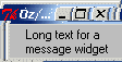
{M set("Long text for a message widget")}
{Wait R} % R will be bound when the window is closed
{Show {String.toAtom R}}
end
7.10.1 Description
A message is a widget that displays a textual string. A message widget has three special features. First, it breaks up its string into lines in order to produce a given aspect ratio for the window. The line breaks are chosen at word boundaries wherever possible (if not even a single word would fit on a line, then the word will be split across lines). Newline characters in the string will force line breaks; they can be used, for example, to leave blank lines in the display.
The second feature of a message widget is justification. The text may be displayed left-justified (each line starts at the left side of the window), centered on a line-by-line basis, or right-justified (each line ends at the right side of the window).
The third feature of a message widget is that it handles control characters and non-printing characters specially. Tab characters are replaced with enough blank space to line up on the next 8-character boundary. Newlines cause line breaks. Other control characters (ASCII code less than 0x20) and characters not defined in the font are displayed as a four-character sequence \xhh where hh is the two-digit hexadecimal number corresponding to the character. In the unusual case where the font doesn't contain all of the characters in ``0123456789abcdef\x'' then control characters and undefined characters are not displayed at all.
7.10.2 Parameter List
Specific Parameters
Non Specific Parameters
anchor background borderwidth cursor feature font foreground glue handle highlightbackground highlightcolor highlightthickness init ipadx ipady look onCreation padx pady relief takefocus text tooltips
7.10.3 Method List
'raise'
'raise'(1:W): If the W argument is omitted then the command raises the widget so that it is above all of its siblings in the stacking order (it will not be obscured by any siblings and will obscure any siblings that overlap it). If W is specified then it must be a handle to another widget that is either a sibling of this widget or the descendant of a sibling of this widget. In this case the 'raise' command will insert this widget into the stacking order just above W; this could end up either raising or lowering the widget.
bind
bind(event:E action:A args:LA append:AP): Specifies an action LA to execute when the event E is triggered.
Actions can be specified either as a procedure, a pair
Port#Messageor a pairObject#Method(see Section 4.3.3).Events are strings (see Section 8.11.1).
The list of arguments
LAspecifies supplementary information to pass to the action, like the key code of a keypress, or the mouse coordinates of a mouse button click (see Section 8.11.2). IfLAif not specified,nilis assumed.The boolean
appendparameter specifies if the binding overrides the previous binding for this event, or adds a supplementary action. If not specified,falseis assumed.
get
get(parameter1:Variable1 ... parameterX:VariableX): Obtains the value of one or more parameters. parameterX must be a valid parameter for the widget. VariableX must be free variables that will receive the current value of the parameters.
getFocus
getFocus(force:B): if B is false (or by default): if the application currently has the input focus on the widget's display, this command resets the input focus for the widget's display to the widget. If the application doesn't currently have the input focus on the widget's display, the widget will be remembered as the focus for its top-level; the next time the focus arrives at the top-level, it will be redirected it to the widget. If B is true: sets the focus of the widget's display to the widget, even if the application doesn't currently have the input focus for the display. This command should be used sparingly, if at all. In normal usage, an application should not claim the focus for itself; instead, it should wait for the window manager to give it the focus. B must be a boolean.
getGrabStatus
getGrabStatus(1:V): Binds V to the atom none if there is no grab on the widget, to the atom local if there is a local grab and to global if there is a global grab. V must be a free variable.
lower
lower(1:W): If the W argument is omitted then the command lowers the widget so that it is below all of its siblings in the stacking order (it will be obscured by any siblings and will not obscure any siblings that overlap it). If W is specified then it must be a handle to another widget that is either a sibling of this widget or the descendant of a sibling of this widget. In this case the lower command will insert this widget into the stacking order just below W; this could end up either raising or lowering the widget.
releaseGrab
releaseGrab: Releases the grab on the widget if there is one, otherwise does nothing.
set
set(parameter1:value1 ... parameterX:valueX): Changes the value of one or more parameters. parameterX must be a valid parameter for the widget. valueX must be a valid value for the parameter.
setGrab
setGrab(global:B): Sets a grab on the widget. If B is true then the grab is global, otherwise it is local (B false by default). If a grab was already in effect for this application then it is automatically released. If there is already a grab on the widget and it has the same global/local form as the requested grab, then the command does nothing. Local grab affects only the grabbing application: events will be reported to other applications as if the grab had never occurred. A global grab locks out all applications on the screen, so that only the given subtree of the grabbing application will be sensitive to pointer events (mouse button presses, mouse button releases, pointer motions, window entries, and window exits). During global grabs the window manager will not receive pointer events either. Warning: whe a grab is set, it is define for the whole Oz process so that it will prevent the user to do input to other windows as well. Moreover a grab is still effective even if the window that contains the grabbed widgets is hidden. B must be a boolean.
winfo
winfo(parameter1:value1 ... parameterX:valueX): This commands works like the get method, but for window-related information. For more details, see Section 8.9.
7.10.4 Detailed Parameters List
1
1:VS: Specifies the text displayed inside the widget (same as text). This parameter can be only used with the set() and get() methods.
aspect
aspect:I: Specifies a non-negative integer value indicating desired aspect ratio for the text. The aspect ratio is specified as 100*width/height. 100 means the text should be as wide as it is tall, 200 means the text should be twice as wide as it is tall, 50 means the text should be twice as tall as it is wide, and so on. Used to choose line length for text if width option isn't specified. Defaults to 150.
justify
justify:A: Specifies how to justify lines of text. Must be one of the following atoms: left, center, or right. Defaults to left. This option works together with the anchor, aspect, ipadx, ipady, and width options to provide a variety of arrangements of the text within the window. The aspect and width options determine the amount of screen space needed to display the text. The anchor, ipadx, and ipadi options determine where this rectangular area is displayed within the widget's window, and the justify option determines how each line is displayed within that rectangular region. For example, suppose anchor is e and justify is left, and that the message window is much larger than needed for the text. The text will be displayed so that the left edges of all the lines line up and the right edge of the longest line is ipadx from the right side of the window; the entire text block will be centered in the vertical span of the window.
anchor
anchor:A: Specifies how the information in a widget (e.g. text or a bitmap) is to be displayed in the widget. A must be one of these atoms: n, ne, e, se, s, sw, w, nw, or center. For example, nw means display the information such that its top-left corner is at the top-left corner of the widget.
background
background:C: or bg:C: Specifies the normal background color to use when displaying the widget. C must be a valid color (see Section 8.2).
borderwidth
borderwidth:P: Specifies a non-negative value indicating the width of the 3-D border to draw around the outside of the widget (if such a border is being drawn; the relief option typically determines this). The value may also be used when drawing 3-D effects in the interior of the widget. P must be a valid screen distance (see Section 8.6).
cursor
cursor:A: Specifies the mouse cursor to be used for the widget. A must be a valid cursor (see Section 8.7)
feature
feature:A: Specifies a feature name for the container object to reference the object controlling this widget. For more details, see Section 4.2. A must be an atom.
font
font:F: Specifies the font to use when drawing text inside the widget. This parameter can't be get at runtime, however it can be set. F must be a valid font (see Section 8.8)
foreground
foreground:C: or fg:C: Specifies the normal foreground color to use when displaying the widget. C must be a valid color (see Section 8.2)
glue
glue:A: Specifies how a widget must fit in its own available place. A must be an atom that is any combination of n, s, w and e. If a direction is specified, the corresponding border is glued to its neighbor or border of the frame if there is no neighbor. If a direction is not specified, the corresponding border if such that the widget takes just the width or height it needs to draw itself. If none of opposite directions is specified, the widget is centered. For more details, see Section 4.1.
handle
handle:V: Specifies a variable to reference the object controlling this widget. This variable is bound when the window is built. For more details, see Section 4.2. V must be a free variable.
highlightbackground
highlightbackground:C: Specifies the color to display in the traversal highlight region when the widget does not have the input focus. C must be a valid color (see Section 8.2)
highlightcolor
highlightcolor:C: Specifies the color to use for the traversal highlight rectangle that is drawn around the widget when it has the input focus. C must be a valid color (see Section 8.2)
highlightthickness
highlightthickness:P: Specifies a non-negative value indicating the width of the highlight rectangle to draw around the outside of the widget when it has the input focus. If the value is zero, no focus highlight is drawn around the widget. P must be a valid screen distance (see Section 8.6).
init
init:VS: The initial text displayed inside the widget. This parameter is valid at creation time only. VS must be a virtual string. This parameter is only valid at creation time.
ipadx
ipadx:P: Specifies a non-negative value indicating how much extra space to request for the widget in the X-direction. When computing how large a window needs to be, the widget will add this amount to the width it would normally need (as determined by the width of the things displayed in the widget); if the geometry manager can satisfy this request, the widget will end up with extra internal space to the left and/or right of what it displays inside. Most widgets only use this option for padding text: if they are displaying a bitmap or image, then they usually ignore padding options. P must be a valid screen distance (see Section 8.6)
ipady
ipady:P: Specifies a non-negative value indicating how much extra space to request for the widget in the Y-direction. When computing how large a window needs to be, the widget will add this amount to the height it would normally need (as determined by the height of the things displayed in the widget); if the geometry manager can satisfy this request, the widget will end up with extra internal space above and/or below what it displays inside. Most widgets only use this option for padding text: if they are displaying a bitmap or image, then they usually ignore padding options. P must be a valid screen distance (see Section 8.6)
look
look:L: Specifies a look to use for the widget. A look specifies default values for the parameters of widgets. This parameter can be specified at creation time only. Moreover changing a look will not change the appearance of widgets that are already displayed with that look. See Section 5.1 for more details.
onCreation
onCreation:P: When a widget is created, for example by QTk.build, this parameter specifies an action to execute right after the widget has been created, but before returning from the build instruction. It is usefull if one needs the handle of the widget to initialize it in ways not permitted by its description record (for example binding the Enter or Leave mouse events).
padx
padx:P: Specifies how much horizontal external padding to leave on each side of the widget. This space is added outside the widget border. P must be a valid screen distance (see Section 8.6)
pady
pady:P: Specifies how much vertical external padding to leave on each side of the widget. This space is added outside the widget border. P must be a valid screen distance (see Section 8.6)
relief
relief:A: Specifies the 3-D effect desired for the widget. Must be one of these atoms: raised, sunken, flat, ridge, solid or groove. The value indicates how the interior of the widget should appear relative to its exterior; for example, raised means the interior of the widget should appear to protrude from the screen, relative to the exterior of the widget.
takefocus
takefocus:B: Determines whether the window accepts the focus during keyboard traversal (e.g., Tab and Shift-Tab). Before setting the focus to a window, the traversal mechanims consult the value of the takeFocus option. A value of false means that the widget should be skipped entirely during keyboard traversal. true means that the widget should receive the input focus as long as it is viewable (it and all of its ancestors are mapped). B must be a boolean.
text
text:VS: Specifies a string to be displayed inside the widget. The way in which the string is displayed depends on the particular widget and may be determined by other options, such as anchor or justify. VS must be a virtual string.
tooltips
tooltips:VS: Specifies a tooltip for the widget. A tooltip is a small message that appears when the mouse cursor if left still over the widget for a while. If VS is set to nil, no tooltip will appear at all. VS must be a virtual string.
return
return:V: When the window is closed, V is bound to the contents of the label. V must be a free variable.